
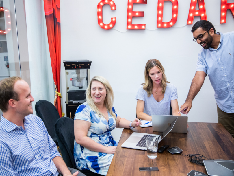
When Mu-Hwa Kuo joined Cedar a year and a half ago, one of her first tasks as a senior visual designer was to perform an audit on the healthtech company’s existing user interface. At the time, she knew Cedar was considering a complete design refresh of its flagship products. But she was still surprised with what she found.
According to Kuo, the company had 63 unique colors of text and 33 different sizes of typography across its slate of products.
“You don’t need that many,” Kuo said. “When you looked at the design layouts together, they didn’t even look like they were related. They didn’t even look like cousins.”
Kuo understood how it got this way, though. When patient payment and engagement platform Cedar launched in 2016, it was a small and scrappy company that built products independent from one another, adding pages and features without worrying about the overall look and feel of the whole system.
But Cedar isn’t quite so small anymore.
“From 2019 to today, we’ve gone from 50 people to 150-plus people,” Ben Kraus, the company’s director of product marketing, said. This level of scale meant it was finally time to overhaul Cedar’s existing layouts, and implement a new design system.
Phase one was recently completed, and the company’s Cedar Pay tool now has a clean and modern feel that provides Cedar users with a more seamless and uniform experience, while setting the tone for how Cedar’s products will look moving forward.
“We want the website to look as if it was designed and engineered by one person, even though there's a whole suite of engineers and designers working on it,” Sojung Park, a full-stack engineer at Cedar, said.
Below, three team members responsible for the design refresh detailed what went into it, why the company went that direction and some of the challenges they faced along the way.
Why was this new design system implemented in the first place?

Kuo: The design refresh came about because we took a step back and looked at the problem. Holistically, we were trying to answer the question: When we grow, how do we build products sustainably? When you’re a smaller company, you can get away without having a design system. But this project came about because Cedar was growing, and it needed to be able to sustain that growth.
Park: From an engineering point of view, we desperately needed more organized code. We were using two CSS libraries, and then editing them to suit our needs. On top of that, we were adding our own custom CSS style sheets. So we had this “Frankenstein” of three different style sheets going on. From the engineering side, we took this design refresh as an opportunity to really clean up all our CSS and come up with a single style sheet that goes with all the pages on our app.
We wanted to root our design decisions in patient empathy and accessibility.’’

Kraus: From the end user patient perspective, the design refresh was aimed to deliver a super cohesive experience that feels seamless and feels like one singular experience. As opposed to where you have different pages that might have subtle variations, like different font sizes and colors.
What were some early decisions that needed to be made in the design process?

Park: When Cedar was a smaller company, we were focused on pushing the product out and getting it live as opposed to optimizing our code structure. The way we got to the Frankenstein CSS was we were using third party libraries. We were using Bootstrap and also this library called Basscss. These are tools that create demo websites really fast. You can add a button class and it’ll give you this pre-designed button, but the problem with that is it looks just like any other website that uses the same library. So in order to inject our own voice, suit our client’s needs and make the patient experience seamless, we needed to have a more singular, organized CSS.
Kuo: We needed to decide on a direction at Cedar, because before, we didn’t have that point of view of what our product should be. I led a few design exercises at the beginning to help determine what Cedar Pay should look and feel like. We wanted to root our design decisions in patient empathy and accessibility. In the early days, we spent a lot of time talking about what colors we should use to make Cedar Pay feel trustworthy. What should the typography scale be so that it’s mobile friendly? We dug really, really deep to just lay the foundation for color, typography and spacing.
COOL BLUE
How did you implement some of these changes?
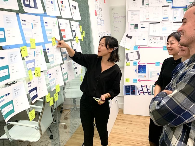
Kuo: After that beginning stage, we got into exploring the components. There’s a methodology of building products called “atomic design.” It’s called atomic design because you think about your products as organisms. You zoom down to its atomic level, and you ask yourself, “What does a button look like?” and “How does that fit into the overall system?” Then you build upon that idea until the product gets bigger and bigger. If you start off with solid consistent atoms, then that means you build larger, sustainable products.
Park: On the engineering side, we started by asking ourselves, what would we do if we were to build Cedar from scratch? We didn’t want to be constrained by our current CSS parameters. There’s a CSS library called Tailwind CSS, which allows you to generate a style sheet that has only the classes that you need. It’s based on the atomic CSS approach. I don’t think it’s a coincidence that we used atomic design and atomic CSS hand in hand. The premise of atomic CSS is that each class should only do one thing. My responsibility was to build a module that allows us to generate this style sheet that’s based on one single file that has all the values that we want for padding, font sizes and colors.
What are the challenges of undertaking a design refresh?
Park: I think the challenge is maintaining a balance between flexibility and organization. As we said, this website is kind of a living organism that you have to constantly maintain and update as you go.
Kuo: We have to be aware of what our future selves need. The design system is meant for everybody to own, which means as we continue to build, we do need to revisit some initial decisions and reevaluate and see if they still fit for the future version of ourselves and of this product.
Earlier this year, we were trying to solve branding for our existing clients. But then in the past few months, we signed on bigger clients with newer and bigger branding requirements. All of a sudden, this thing we were doing two months ago doesn’t work for what we’re doing right now. How do we roll with that? The answer is, we have to keep going, we have to keep iterating, we have to keep building on this thing that we created already. Because that’s just good product development.
What are some new details of this design system that differ from the older layouts?
Kuo: The buttons. I made an inventory of all the buttons and the links from my full audit back in 2019, and it’s amazing to see how different they look today. They’re more striking, higher contrast and way more eye-catching. It's really funny though, because we spent so much time on this, and then people will just look at it, click a button and move on. But that's the whole goal — to look at something and know exactly what needs to be done next. And I think we achieved it.
Kraus: The way I like to think about it is, it doesn’t feel like healthcare. When you’re using a patient portal app, or any other sort of health tech app, you’re not expecting great design. But as a user, it feels super modern and fresh. There’s more whitespace. It just breathes. And so far, we’ve gotten great feedback from our clients.


