Diversity and inclusion in design goes beyond ensuring that the people pictured on landing pages and in product shots are representative of society as a whole. It also includes designing user experiences that take into account the more than 1 billion people who experience some form of disability, according to the World Bank.
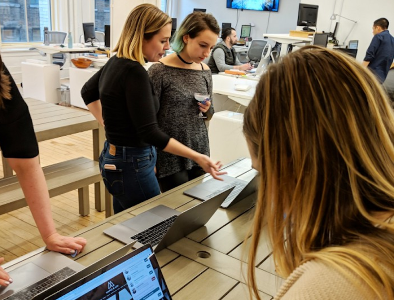
Companies that offer web design services play an outsized role when it comes to making the internet a more accessible and inclusive place. Take BentoBox, which designs websites and online ordering platforms for restaurants. While BentoBox prides itself on beautifully designed websites, Kayla Scheidel, web design lead, says her team also makes it a point to ensure their sites are accessible to all.
“It’s easy to be hyper-focused on the user interface and its design, but when it comes to accessibility, it’s crucial to also think about the experience,” Scheidel said.
BentoBox has extensive experience with accessible UX/UI design, having worked on the websites and online ordering platforms of over 6,000 restaurants. Scheidel recently shared some of her team’s accessibility best practices with Built In New York along with the common missteps she sees designers make and how to correct them.

What are the key best practices your team has in place when it comes to accessibility?
The BentoBox platform is built to be accessible, so it is up to us on the design team to uphold that same standard and ensure that whatever design and content are added stay within our best practices. Our best practices include, but are not limited to: utilizing color palettes with contrast ratios that meet ADA standards, avoiding any adjustments to the native browser controls and confirming that features like a play/pause toggle are used when motion elements are present.
We continue to learn and expand our knowledge of accessibility and lean on a few resources for our day-to-day accessibility checks, including the Accessible Colors website and the WAVE accessibility tool.
We continue to learn and expand our knowledge of accessibility.”
Can you share one to two examples of what accessible UX/UI design looks like in your team’s work?
A perfect example of what accessible design looks like to us is Daily Provisions’ website, one of our Union Square Hospitality Group websites.
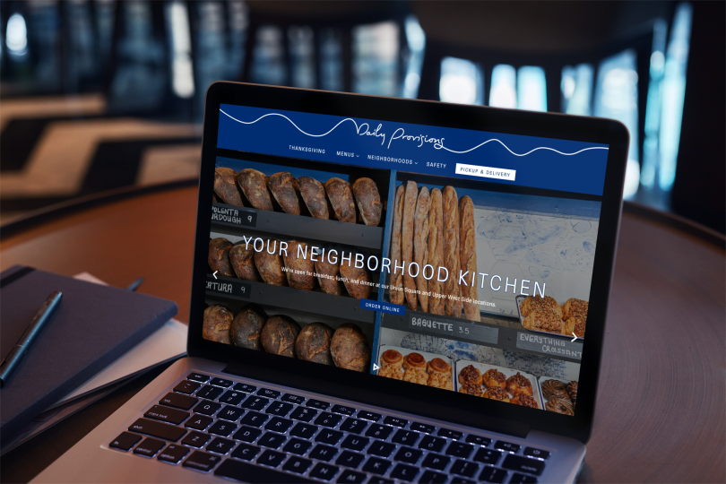
As you click through the site, you can see some of our best practices in action. The user experience is easy to navigate and digest, with gallery arrows and a play/pause toggle on the homepage hero, as well as an accessible color palette that makes content easily legible.
What are some common missteps you see UX/UI designers make when it comes to accessibility, and what can designers do to avoid them?
I’ve seen many websites where the typographic hierarchy — organizing type to establish an order of importance — is not clear or legible. To avoid this, designers can focus on creating an order to the headings as you scroll through the page, as well as check to see that the color and size of the font/typeface are large enough that the user doesn’t need to zoom in. Chances are if you’re having trouble reading it, so will the user.
Another common misstep is ignoring the focus states of hyperlinks. Another one of our team’s best practices is tabbing through a website’s content to make sure that all necessary information has a visible focus state that differentiates it from the body text and indicates that it is clickable. This is crucial because some design choices can affect a link’s hover state and potentially remove it altogether. That being said, the focus states can be easily edited using CSS to fit the aesthetics of your design.