Last year was a promising one for Stash. According to a recent release announcing its $125 million Series G, 2020 saw a 100 percent increase in new accounts and its user base balloon to 5 million-plus customers, among other metrics.
Yet, amidst that growth, the fintech organization decided to shake things up.
“When you such record growth in a year like 2020, it begs the question: What do we need to do to not only to maintain this momentum but also to accelerate it?” Chief Creative Officer Chidi Achara said.
Achara was brought aboard in the fall of 2020 as the company’s inaugural CCO to help spearhead a total brand overhaul. Rolled out in December, its motivations were largely twofold. Creatively, Achara said that five years was the “right time” for an aesthetic update and more importantly, as the platform’s offerings expanded and diversified, a need to reaffirm their brand identity emerged.
Helping ensure that those creative changes are executed upon is VP of Design and Research Nasahn Sheppard, who came aboard shortly after Achara. While the changes encompass all facets of the brand (think: advertising, social media and other channels), it’s Sheppard and his team who work in tandem with Achara’s to ensure that creative decisions are faithfully realized in the app, where new changes include a logo, color palette and other updates impacting both the visual engagement and user experience.
“My remit was very clear: to take our product, elevate it and create a system where it’s ready for scalability, both from a product and a team standpoint,” Sheppard said. “We’re reducing the friction at every single touch point so that the product itself becomes effortless, easy to use and can get out of the way and empower our customers to do what they came here to do, which is build long-term wealth.”
“We really took the opportunity to heart,” Product Design Manager Silvia Tueros-Cossio added. “From our design system to our user journeys, we’re looking at everything through a different lens.”
With the rebrand still fresh, and the design team actively looking for more members to join its team, Achara, Sheppard and Tueros-Cossio unpacked the key parts of the refresh and how they hope it will benefit end users.
What spurred the need for the rebrand?

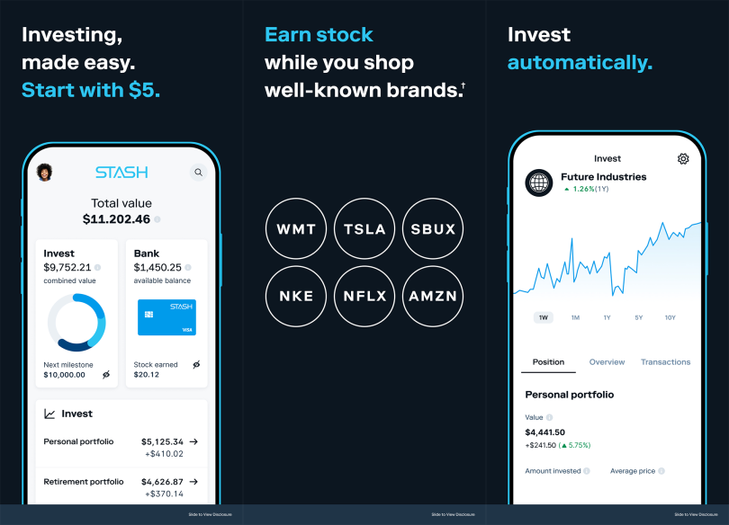
Achara: When we launched, we had a very clear and concise value prop and brand message, which was, essentially, “investing made easy.” Over time, we built a full suite of different financial products and tools on our platform. As a result, we reached a point where we really needed to clarify who we were because it’s impossible for a brand at this particular stage of growth to take on all competitors on all fronts. We felt that in order to drive that next stage of growth and be competitive in the long term, we needed a sharp arrowhead in the market.
How does that creative vision help inform product choices and decisions?

Sheppard: Honing in on the brand helps us drive clarity around how we construct the experience in the product. Our customers are largely first-time investors; they may not even know what a stock means. We have a responsibility to not only invite them in but to also educate them on how to invest. From a design perspective, having a sharp brand helps us get very clear about whether we are or are not living up to that brand. It gives us a very simple rubric as we think about redesigning our product, reducing the cognitive load and making sure we’re designing a frictionless experience.
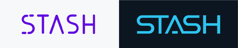
Achara: One is the logo, which we wanted to give a bit more weight. We wanted it to feel modern and elegant, but at the same time, it has echoes of retro as well as classicism as well as futurism. Secondly, color: We were very much known as the purple brand. While we now have a brand blue, and different expressions of that, we’re going to continue toward a palette that gives us a bit more freedom while still having focus. The third piece is developing rigor around our font usage, honing down on typographic language to reinforce the consistency of our brand identity. The fourth piece focuses on language and messaging. How do we add an element of directness so that we’re communicating ideas with the fewest possible words for the sake of simplicity and clarity?
Sheppard: That blue means do something — there’s an action, whether it’s buying or selling an investment, helping to navigate key areas in the app, and so forth; before, it was maybe a little more confusing. Also, we’ve opened up room in the app. We have tiles that serve main functions. We’ve expanded those and given them a little bit more breathing room so that they reduce the visual noise and we set a baseline by removing a bunch of different features and functions so that we can focus the conversation towards investing.

Tueros-Cossio: The simplified color palette has really helped us put the focus back on the experience with fewer distractions. Also, we’ve included some accessibility settings to increase color contrast to make sure that we’re meeting those Web Content Accessibility Guidelines (WCAG). We’re continuing to work very closely with the research team to look for other opportunities and continuing to test with different groups of people to make sure that people with disabilities can all access the product.
What other changes stand out to you as being notable?
Tueros-Cossio: We’ve always valued inclusive thinking; as we continue to scale, it’s become a top priority for us as a design team. Things like dark mode and introducing accessibility features are things customers asked for. Once that came up as something that needed to happen, we acted quickly and made sure to thoroughly test to make sure that people from all backgrounds were able to access the product in the right ways.
Also, we invested in our design system and our design systems team. Focusing on consistency and making sure that the elements that we use to build out the experience are working well allows our UX designers to focus on the journey and focus on collaborating with all of our partners, from CX to UXR to data science.
Every problem that we hear from customers is an opportunity for us to serve them better.”
Sheppard: We’re starting to drive consistency throughout the touchpoints in our product. That includes the call-to-action colors, highlighted with a brand blue, so that we can really make sure that customers know what’s an active thing and what’s an inactive thing; what’s passive information, versus something that’s going to help them achieve their goals. We’re thinking about flow through the app, as opposed to individual moments. Driving that visual and functional consistency helps users navigate and reduce their cognitive load without having to reorientate every time they think about the app. To make these changes, we leverage research. Every problem that we hear from customers is an opportunity for us to serve them better.
Achara: People have to believe that we’re serious and not fly-by-night. That level of responsibility and gravitas has to be reflected in our brand identity. We still have our disruptive spirit, but we’ve grown up. We have evolved into being more neo-institutional in our look, feel and the way that we engage with our customers.
Executive Vision
What will the success of these efforts in sum look like to you?
Achara: On a rational level, there are fairly standard metrics that we look at, like traffic and conversions. On an emotional level, I want Stash to be beloved by Americans as an explicit set of experiences and tools that add significant value to their lives.
Tueros-Cossio: I’ll be looking at App Store reviews, customer interviews and even conversations with people on the street. When sentiment starts to change, and I hear that love about our brand in their voice, I’ll know that we’re doing a great job.
Sheppard: I want every single customer to say, “You’re helping me.” The metric that I care most about is: Are we growing customers’ wealth and helping them create financial freedom? Everything else doesn’t matter. If we’re doing that, we’re serving them well.