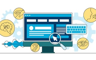
According to the CDC, 61 million adults in the U.S. have a disability, and nearly six percent of those people are deaf or have difficulty hearing.
But for adults over the age of 70 who have difficulty hearing, less than 30 percent have ever used hearing aids. Even fewer young adults and middle aged folks who would benefit from hearing aids have ever used them — just 16 percent.
Jabra Hearing is on a mission to address untreated hearing loss and make it more accessible for people to hear better. But accessibility at the company extends beyond its mission to empower people who are deaf or who have difficulty hearing. Accessibility is at the heart of its product, which includes an online hearing test.
To make it approachable, Nicole Cadoret, head of design, and her team think beyond accessibility as it relates to disabilities. They look at accessibility in its broadest form: inclusive of everyone.
“Broaden your vision of who benefits from accessibility,” Cadoret recommends. “Think of the construct of ‘disabled’ as an impermanent state. That, as humans, we all fall into and out of levels of ability.”
Sometimes, it’s permanent — Cadoret is deaf in her left ear and relies on a hearing aid.
Sometimes, it’s transitory. New parents might only be able to use one hand because they are carrying a newborn. People experiencing vertigo could benefit from a grab bar in a restroom.
“Everyone needs accommodations at some point or another,” Cadoret said. “With that in mind, we approach problem-solving with the broadest view of accessibility. As a result, our solutions are more inclusive overall.”
Built In NYC sat down with Cadoret to learn how her approach to accessible design comes to life on Jabra’s platform and the advice she has for other designers looking to bring accessible design into their work.
What are some examples of what accessible UX/UI design looks like in your team's work?
Within our broad lens of accessibility, we zero in on the specific needs of our audience. Our largest demographic is those over the age of 50. They visit us on mobile, desktop and tablet. Addressing your hearing issue requires a lot of education and consideration, so ensuring content is legible, digestible and approachable on all platforms is critical. We ensure our online hearing test is easy to understand and simple to use. We are ruthless in maintaining the usability and accessibility of our online hearing test by using large buttons, generously sized typography, color coding and, importantly, concise language and directions.
We’ve just rebranded, which gave us an opportunity to re-evaluate our design system and validate its accessibility. The design system supports generous type size and a Web Content Accessibility Guidelines AA-compliant color palette and contrast levels.
What are some common accessibility related missteps that you often see UX/UI designers make, and what can designers do to avoid them?
Valuing aesthetics and brand over accessibility and usability.
I love a beautiful color palette, but contrast ratios for text and UI components must meet the WCAG. There are free and easy-to-use online tools, like Web AIM and Accessible Colors, available to help designers validate their typography and UI color choices. Once you’ve hit the accessibility bar, then make design trade offs to support aesthetics and brand.


